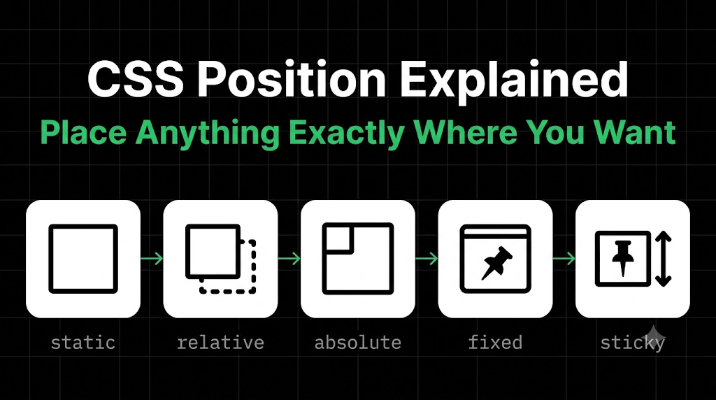
CSS Position: How to Place Anything Exactly Where You Want
Open any website and look closely. The navbar stays at the top while you scroll. A small “NEW” tag sits on the corner of a card. A chat button floats in the bottom corner. None of that happens by accident.
All of it is done with one CSS property: position. In this blog, we’ll build a tiny page and use each value in a real place, so you see why it exists, not just what it does. It’s written for beginners, so no prior knowledge is needed.
The Starting Point: Normal Flow
Before we move anything, we need to know where things sit by default. The browser stacks block elements one below the other, like books on a shelf. That’s called the normal flow, and it’s what every element follows unless you tell it otherwise.
position is how you tell it otherwise. It works with four helpers: top, right, bottom, and left, which say “how far from this edge.”
Here’s our page:
<nav class="navbar" id="top">My Site</nav>

<div class="card">
  <span class="badge">NEW</span>
  <h2>Product Name</h2>
</div>

<div class="spacer">Keep scrolling ↓</div>

<a href="#top" class="top-btn">↑ Top</a>
And one small block of base styling, so every box is visible. You set it once and never touch it again:
body {
  background: #1a1a1a;
  color: #fff;
}

.navbar, .card, .badge, .top-btn, .spacer {
  background: #262626;
  border: 2px solid #4da3ff;
  padding: 12px;
}

.card   {
  width: 300px;
  margin: 40px auto;
}

.spacer {
  height: 1500px;   /* makes the page long enough to scroll */
}
From here on, we’ll only look at the position lines.
1. static: Doing Nothing Special
Every element starts as static. It follows the normal flow, and top, left, and the others have no effect.
.card {
  position: static;   /* the default */
}
You rarely type this yourself. Just remember it as the “starting line” every other value moves away from.
2. sticky: The Navbar That Follows You
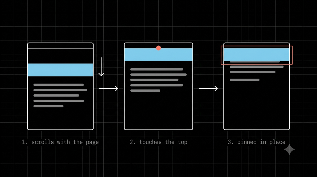
We want the navbar to scroll with the page at first, then stay pinned to the top once it reaches it.
.navbar {
  position: sticky;
  top: 0;
  z-index: 100;
}
The top: 0 is the instruction: “stick when you touch the top of the screen.” Without it, sticky does nothing. A sticky element also stays inside its parent, so it only sticks while that parent is still on screen. (We’ll explain z-index near the end.)
3. relative: Preparing the Card
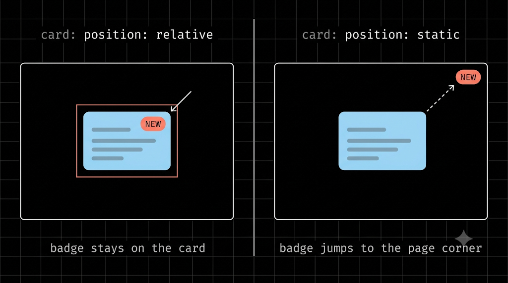
Next, the badge. We want “NEW” on the card’s corner. But first, the card has to become a reference point, and that’s the second job of relative.
.card {
  position: relative;   /* now the badge can measure from here */
}
Nothing changes visually, but any absolute child inside the card will now measure from the card instead of from the whole page.
relative also lets you nudge an element with top and left while its original space stays reserved. That’s less common, though. Most of the time, you’ll use relative just to create a reference point, like we’re doing here.
4. absolute: The Badge on the Corner
Now the badge:
.badge {
  position: absolute;
  top: 10px;
  right: 10px;
}
An absolute element is removed from the normal flow, and it positions itself relative to the nearest ancestor that isn’t static. Here, that’s our card, so the badge sits 10px from the card’s top and right edges.
Now, a small experiment worth doing: change the card back to position: static and refresh. The badge jumps to the corner of the whole page. That’s the number one beginner confusion with absolute, and now you know why: it climbed up looking for a positioned parent and found none.
5. fixed: The Back-to-Top Button
Finally, the floating button:
.top-btn {
  position: fixed;
  bottom: 20px;
  right: 20px;
}
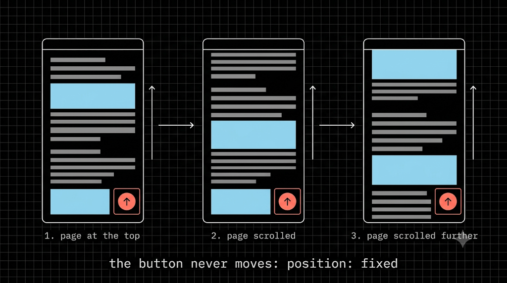
A fixed element is placed against the screen (viewport), and it doesn’t move when you scroll. Scroll up, down, or all the way to the end of the page, and the button stays in the same corner. Clicking it jumps back to the navbar, because of the href="#top" in the HTML. Like absolute, a fixed element is removed from the normal flow, so it can cover other content. Leave breathing room for it.
Putting It All Together
- static: the default starting line
- sticky: scrolls, then pins at an offset (navbar)
- relative: stays in flow, and acts as a reference for children (card)
- absolute: pinned to the nearest positioned ancestor (badge)
- fixed: pinned to the screen (back-to-top button
What if Elements Overlap? z-index
When positioned elements land on top of each other, z-index decides which one is in front. A higher number wins. You’ve already seen it in the navbar: without z-index: 100, the card’s badge can slide over the navbar as you scroll. Remember that z-index only works on positioned elements (anything except static).
Mistakes Almost Everyone Makes
- Absolute without a relative parent: the element flies to the page corner.
- Sticky without an offset: add
top: 0or it won’t stick. - Fixed elements covering content: add padding or margin so nothing hides behind them.
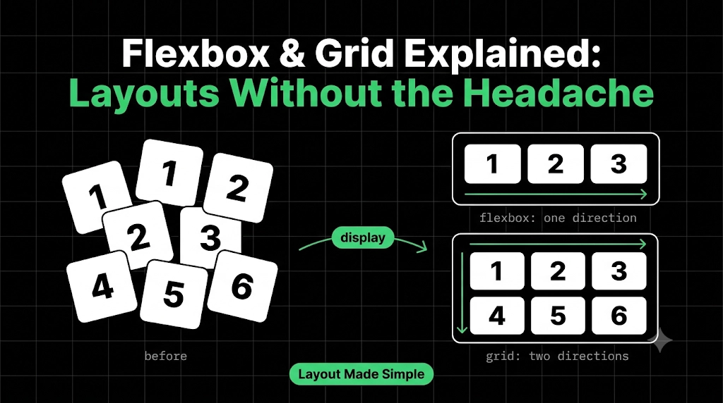
- Using absolute for entire layouts: it’s great for small overlays, but whole page layouts need a better tool, which is exactly what Flexbox and Grid are for.
Wrapping Up
position isn’t about memorizing five words. It’s about asking one question: “What should this element be measured against?” The page flow, its own spot, a positioned parent, or the screen. Answer that, and the right value picks itself.
Comments
Join the discussionNo comments yet. Be the first to comment.
HTML, CSS & the Browser
A beginner-friendly HTML & CSS series for developers. Learn how browsers turn code into pages, then build up your skills one concept at a time, with simple analogies and clear diagrams.