CSS Flexbox and Grid: Build Real Layouts Without the Headache
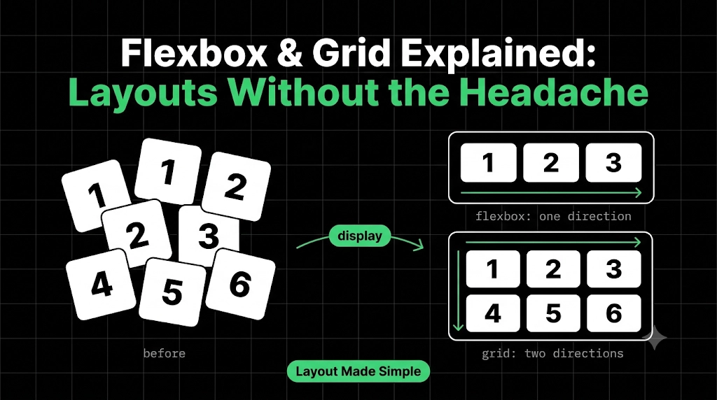
Last time, we used position to pin a badge to a card and a button to the screen. But try building a whole page that way, with a header, a sidebar, and a row of cards, and you end up fighting pixel offsets that break on every screen size.
CSS has two tools built exactly for this: Flexbox and Grid. This blog is for beginners, and by the end you’ll know what each one does, when to pick which, and you’ll build a real page layout with them.
The Big Idea
Both tools work the same way. You don’t move each child yourself. You tell the parent how to arrange its children, and the children follow. The parent is the container, and the children are the items. One line turns it on:
.container {
	display: flex;   /* or: display: grid; */
}
We’ll use this HTML throughout:
<div class="container">
	<div class="item">1</div>
	<div class="item">2</div>
	<div class="item">3</div>
</div>
And one small base block, so every box is visible. The container gets a coral outline, so you can always see its edges:
body {
	background: #1a1a1a;
	color: #fff;
}

.container {
	border: 2px solid #ff6b4a;
	padding: 10px;
}

.item {
	background: #262626;
	border: 2px solid #4da3ff;
	padding: 20px;
}
From here on, we only look at the lines that matter.
Flexbox: Arranging Things in One Direction
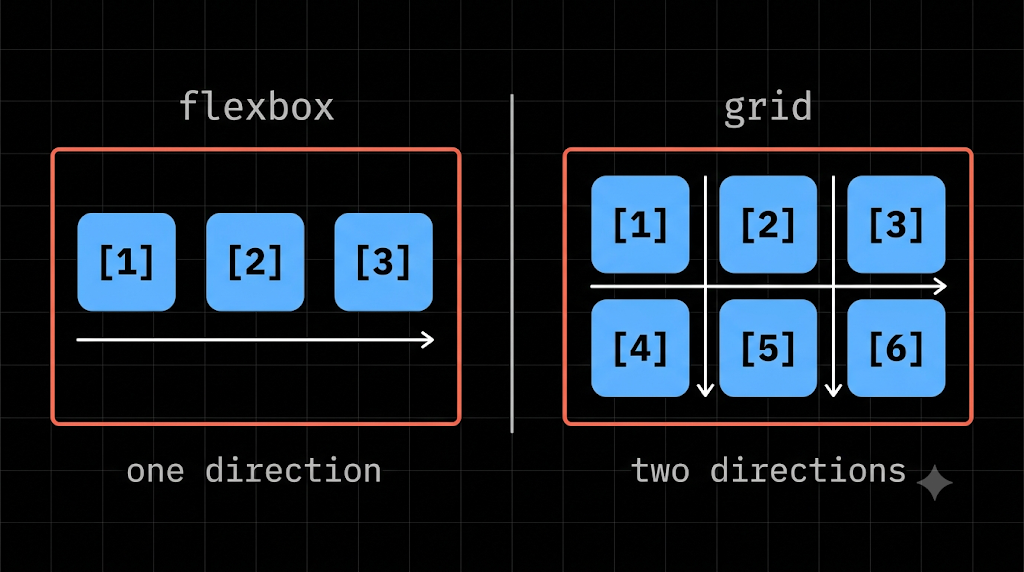
Flexbox lays items out in one line, as a row or a column. Add one line, and the stacked boxes jump side by side:
.container {
	display: flex;
}
The two axes
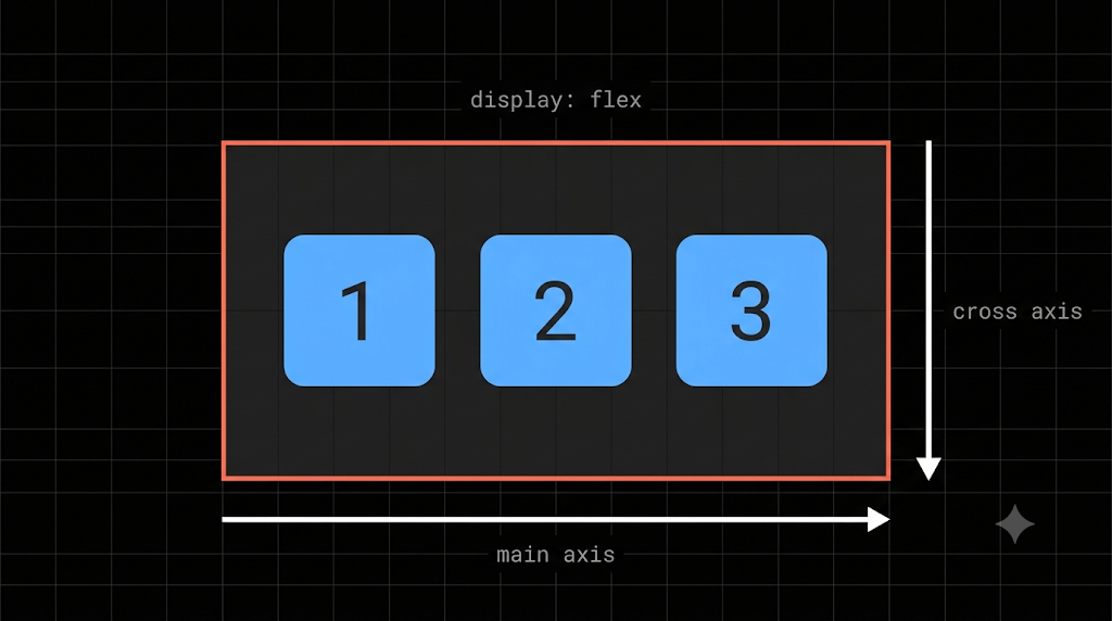
Every flex container has two directions, and this idea makes everything else click:
- Main axis: the direction items flow in (a row by default, left to right).
- Cross axis: the direction across it (top to bottom).
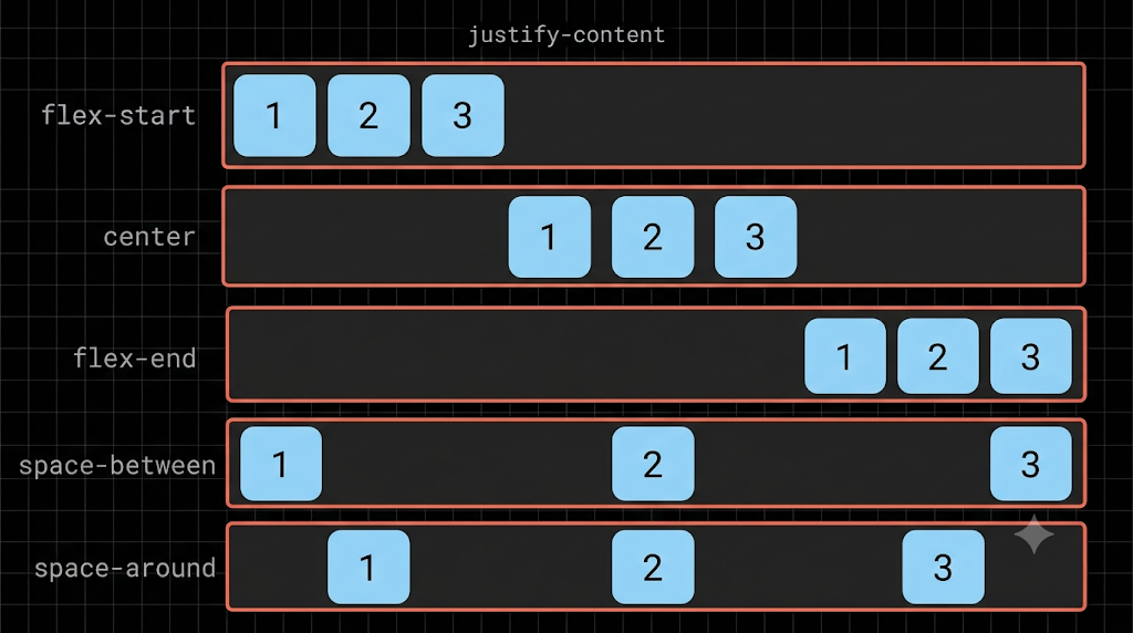
justify-content: spacing along the main axis
.container {
	display: flex;
	justify-content: space-between;
}
Common values are flex-start, center, flex-end, space-between, and space-around. With space-between, the first item hugs the left edge, the last hugs the right, and the rest spread out evenly. That’s exactly how a navbar with a logo on the left and links on the right is built.
align-items: alignment along the cross axis
.container {
	display: flex;
	align-items: center;
}
This lines items up in the middle, vertically. Put both together, and you get the most famous trick in CSS, perfect centering:
.container {
  display: flex;
  justify-content: center;
  align-items: center;
  height: 300px;   /* needs room to center in */
}
gap and wrap
.container {
	display: flex;
	gap: 16px;          /* space between items */
	flex-wrap: wrap;    /* let items drop to the next line */
}
Without flex-wrap, items squeeze to stay on one line. With it, they move to a new line when they run out of space.
One warning: if you set flex-direction: column, the axes swap. justify-content then works vertically and align-items works horizontally. That trips up almost everyone once.
Grid: Arranging Things in Rows and Columns
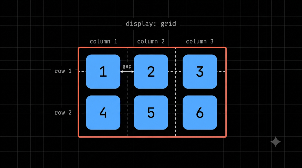
Flexbox handles one direction. Grid handles both at once, like a spreadsheet. You describe the columns, and items fall into the cells.
Columns and the fr unit
.container {
  display: grid;
  grid-template-columns: repeat(3, 1fr);
  gap: 16px;
}
This makes three equal columns. Add six items, and you get two rows automatically, with no need to say how many rows you want.
fr stands for fraction of the available space. 1fr 1fr 1fr means three equal shares, and 2fr 1fr makes the first column twice as wide as the second. The repeat(3, 1fr) above is just a shortcut for writing 1fr three times.
Spanning cells
Sometimes one item should be bigger, like a featured card. That rule goes on the item:
.item:first-child {
	grid-column: span 2;   /* takes two columns */
}
A grid that adapts by itself
This one line is the secret behind most responsive card galleries:
.container {
  display: grid;
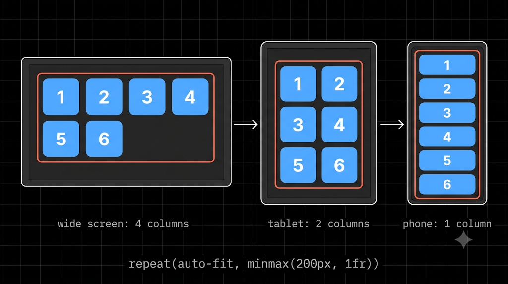
  grid-template-columns: repeat(auto-fit, minmax(200px, 1fr));
  gap: 16px;
}
In plain words: “make as many columns as fit, each at least 200px wide, and share the leftover space.” On a wide screen you might get four columns, on a tablet two, and on a phone one, with no media query.
Flexbox or Grid?
A simple rule works well: Flexbox is for one direction. Grid is for two.
- Use Flexbox for navbars, button groups, centering, or a single row of items.
- Use Grid for page layouts, card galleries, and anything with rows and columns.
You’ll often use both together, so let’s do exactly that.
Mistakes Almost Everyone Makes
- Putting flex properties on the items instead of the container.
justify-contentandalign-itemsgo on the parent. - Forgetting
display: flexordisplay: grid. Without it, nothing else works. - Centering without a height.
align-items: centerneeds room to work with. - Mixing up the axes after
flex-direction: column. They swap. - Using
position: absolutefor layouts. That’s exactly what these two tools replace.
Wrapping Up
Flexbox and Grid share one idea: let the parent arrange the children. Flexbox arranges along one line, and Grid arranges in rows and columns. Learn justify-content, align-items, gap, and grid-template-columns, and you can already build most layouts on the web.
Comments
Join the discussionNo comments yet. Be the first to comment.
HTML, CSS & the Browser
A beginner-friendly HTML & CSS series for developers. Learn how browsers turn code into pages, then build up your skills one concept at a time, with simple analogies and clear diagrams.